Modern trends shape the development of any field. Influenced by technological and cultural background, they tend to change and establish new rules for a particular industry. The mobile app market is not an exception.
When it comes to mobile app trends, they are usually introduced as the new look of OS, appearance of newly produced portable devices and more.
Since the iOS 7 debut in 2013, design standards has changed a lot. UI/UX designers have taken a new way of minimization and interface simplification reflected in iOS 9 and Android Marshmallow. The main feature of modern design is intuitive and engaging interface letting users immerse in the process easily. We tried to pick some of the most trendy mobile app development designs and collected them in the top-7 list.
Material mobile app design
The introduction of this trend took place at Google’s I/O conference in 2014. It remained in demand during 2015 and was titled as one of the catchiest mobile app designs. The idea of this trend was to make it easy and simple for users to engage with various mobile platforms.
The trend originated from what we know as a flat design. It remained trendy for the last few years implemented by professional UI/UX app designers growing into a common standard for different platforms. However, a few changes and modifications took place. Material trend received some features of other popular design types although it looks the same in general.
The classical version of flat design adopted some new features that included glow visual effects, shadows and gradients in addition to translucent components. At the same time, it remained rather functional and user-friendly. Also known under skeuominimalism term, this trend can be met in various applications designed for Apple devices in particular. Google seems not be stand out of this trend introducing its own version of the renewed flat design known as the material design language.
If compared with other trends, material design delivers better users’ experience and easier interaction due to cleaner schemes featuring simple coloring, clear iconography and increased functionality. This type of design got its name after flat objects also known as materials. They are able to divide into several parts, change in sizes and shapes, elevate and more. Apart from providing a better UX, they make the hierarchy clear for the end user. The main feature of the material design is the fact that it does not limit designers letting them express their creativity adding new modifications and improvements. In other words, if you come up with an innovative and functional idea. You should await for a call from Google with an offer to add your concept to their future updates.
You can meet the examples of material design in all major applications delivered by Google. They include such well-known apps like Google Maps, YouTube, Google Drive, Gmail and more. All those apps are available for both Android and iOS platforms. A set of other popular products have also been updated in accordance with flat design guideline. They include Telegram, Tumblr, Evernote and more. Android can boast its Lollipop OS that is developed using the same features and principles. We should also note that some separate material design features have eventually grown into independent trends implemented in iOS and other devices.
Motion app design/functional animation
Some experts and leading UI/UX designers consider functional animation as the main trend that took the audience by storm during 2015. They let users immerse in the process of interaction with the app as well as develop their experience.
The main idea is not just to create animation for animation. This trend is to serve both logical and entertaining purposes as well. If compared with material design that is supposed to be not only practical and fast but also responsive and vivid, the functional animation trend does not limit designers in their creativity. Implemented in various devices in spite of their OS, this animation type has some uncongenial features that still follow a particular practical goal.
Whenever you want to make your UX more engaging, dynamic, interactive and significant, feel free to implement such delightful features as animated response, zooming and visual effects, etc. You can choose from a wide range of effects and response to fit a particular style. The main mission of the functional animation trend is to let user understand the application and feel it from the inside. This trend enable an entertaining and fun interaction, which is certainly a great plus.
Swipe navigation and card layouts in mobile app design
Card layouts appear to be another great way to improve your UX making it more interactive and dynamic. This trend made its debut on the mobile app arena in 2014 and immediately hit the headlines. It went on developing and expanding during 2015. It still shapes the UX standards and tendencies. They main mission of the trend is to keep designers focus more on functionality rather than on visual aspects.
The idea of those cards if to group all vital information in special boxes that are outlined separately and provide an access to more information with only one tap. Considering numerous reviews, such approach is in great demand among users as it delivers an efficient and convenient interaction in addition to vital information contained within outlined boxes. This fact lets users easily sort out and arrange all available applications on their devices in accordance with needs and preferences.
Modern designers offer a wide range of card layouts. They may differ in forms and types. Some of them come as efficient social network boards and feeds. We have a good example of such popular card layouts like Facebook, Tweeter, Tinder, Trello and more. Swipe-based stacks have become more convenient due to this design trend. Let’s have a look at Tinder, which is a popular dating applications. It uses the same navigation type as the fundamental swipe-based feature of its design. Whenever you want to agree on a date or reject an invitation, all you need is to flip through profiles in a necessary direction.
Another great advantage in favor of card layouts is the fact that they suit the need of both users and designers. On the one hand, you only need to tap the screen and get a full access to any additional content. On the other hand, these cards are easy to navigate. Moreover, they contain a huge portion of useful information.
New mobile app navigation means
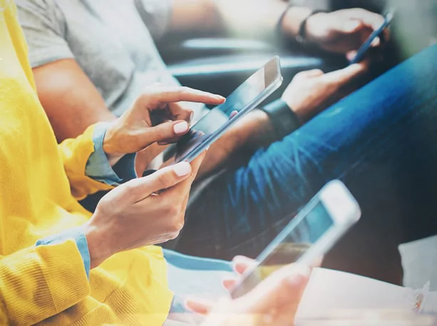
The introduction of phablets came up with some new challenges and difficulties for UI/UX designers. Today users can benefit from larger screens. At the same time, they have changed the way we are used to holding our portable devices. For this reason, all traditional UI and UX design approaches call for reconsideration.
Sticking to trends and standards of the previous years is not actually a good idea. Designers are to adopt new tendencies in case they want to meet users’ expectations. The key goal is to let user access all necessary apps and functions via his or her thumb without facing any difficulties. Designers can simply gather all the elements at the bottom of the screen. Such approach can appear to be a success. It has already been implemented in some devices.
On the other hand, UX designers can work out some additional modifications and improvements. A larger screen means more space for creativity. A good idea is to make applications look more spacious while the content and managing tools can be placed in the context menu.
Wearable mobile app design
We should consider not only smartphones, tablets and phablets, wearable devices must also be taken into account when speaking of design trends. They may include smart watches and glasses. Both have already took the audience by storm and seem to take strong positions on the digital market. According to the latest researches, over 200,000,000 wearable devices will be sold by 2019. It means that it is high time UI and UX designers learned new concepts and paradigms to deliver an award-winning and catchy design implemented in wearable gadgets. Moreover, a user must has an opportunity to integrate all functions and tools with his or her basic portable device.
Implementing an efficient UI/UX design for such devices as Android Wear or Apple Watch has turned into a tough challenge for specialists in this field. It results in numerous complicated features as well as limitations when it comes to the size of particular wearable devices. We should also consider such key factors as the battery capacity. The main problem is about the necessity to limit the quantity and functionality of data located on the display. Designers should stay focused on some fundamental functions, which is not as easy as it may seem. Another obstacle in the way of UI/UX design implementation is a limited user’s interaction with a wearable device. We need to consider all the smallest details from text size to legibility.
Whenever you want to meet functional needs, the best bet is delivering such design elements as darker backgrounds, less animation, hidden menus and more. Otherwise, designers will fail to deliver functionality combined with a good-looking product.
Typography as a mobile app design trend
All the elements on the screen must have a clear hierarchy while headlines and paragraphs must be linked relatively guiding a user from one section to another without any difficulties. Considering a growing number of wearable devices and phablets on the market, designers should be able to implement typography making the application suitable for any gadget in spite of the screen dimensions. We can now benefit from some newly introduced typefaces delivered by both Google and Apple.
Apple’s iOS 7 contains refined with Helvetica Neue fonts. Such approach made designers proceed with handcrafted typography implemented in a particular mobile platform. On the other hand, after the launch of Lollipop OS in 2014, Google’s Roboto font made its debut featuring some trends of material design now available as an open source. Apple’s San Francisco type face is a perfect example of a thoughtful system font developed not only for iOS 9 and OS X but also for Apple Watch providing enough free space between letters in addition to legibility. Such features are essential when it comes to tiny screens of wearable devices.
Diversity of colors in mobile app design
Despite the fact, white backgrounds and subtle colors have been a modern trend for a long time introduced by material design, new tendencies dictate new rules suggesting some vibrant colors in addition to darker backgrounds.
Every color defines the position of a particular element in the general hierarchy. Material design comes as the most flexible tend introducing both light and dark backgrounds. The problem is that most applications still use default white backgrounds. The latest statistic shows that up to 80% of all mobile apps are feature white backgrounds. A few of them opt for different colors. On the other hand, users should have a chance to choose a color they like. Moreover, designers should be more flexible considering such key factors as the time of the day. For example, darker colors are better to use when it is dark and vice versa.
Conclusion
The thing is that a general UI/UX direction is still the same in 2016. We do not observe any dramatic changes yet. Designers use the same trends and approaches that reflect a simplified interface with a focus on functionality and interaction. These tendencies do not seem to disappear especially after the introduction of phablets and wearable devices. The size always matters when it comes to design. It appears that material conceptual approach will still be the main trend at least for the rest of the year.
